RegIndicator – SDG Progress Tracker for Regina
Web Development In Wordpress | Client Interaction | UI/UX Prototyping through Figma
RegIndicator Home Page
Regindicator is a WordPress-based dashboard that visualizes Regina’s progress on United Nations Sustainable Development Goals. Built in collaboration with a local nonprofit, it ingests data from Google Sheets and CSVs, then renders interactive, mobile-friendly charts so stakeholders can explore year-over-year trends and filter by goal or metric.
Tools Used
Prototyping & Web Design
Figma | Wordpress
Figma Prototyping
A high-fidelity homepage prototype was crafted in Figma to translate initial wireframes into a fully interactive design that guided the WordPress build. Color-coded SDG indicators and a WCAG-compliant palette were applied consistently across charts, buttons, and navigation elements, while Gestalt principles ensured related data panels were grouped for intuitive scanning. Constraints on layout and typography maintained visual clarity, and interactive hotspots simulated filter dropdowns, “Learn More” calls-to-action, and icon-based metaphors (e.g., a house icon for infrastructure metrics). Feedback was gathered directly in Figma via comments from both the client and peer reviewers; this drove iterative refinements to chart prominence, menu structure, and affordance signifiers, resulting in a prototype that served as the definitive blueprint for development .
Home Page Design
Design of the homepage focused on being concise and engaging without being too text heavy. The idea was to introduce interactive webpage logo to maintain the attraction of the viewer and emphasize on page's main goal- to showcase Regina's SDG progress.
SDG Page Design
Showcases all the Sustainable Development Goal (SDG) relevant under the contexts of Regina during recent times.
Data Page Design
Inital date page for visualizing numeric details received from Data-for-Good
WordPress Implementation
The final site was built on a custom WordPress framework without relying on Bootstrap, employing the Astra theme as a lightweight starting point and extending its capabilities via key plugins: Elementor (for drag-and-drop page building and ready-made design blocks), ElementsKit (header/footer builders and mega- menu support), Graphina (for embedding interactive charts), Sticky Header Effects for Elementor, and a bespoke Contact Form plugin that captures submissions directly in the admin panel . All high-fidelity prototype layouts from Figma—including the SDG‐colored hero charts, “Learn More” calls-to-action, and icon-metaphor navigation—were reproduced using Elementor templates and custom PHP snippets, with adjustments made to accommodate WordPress’s rendering model and plugin constraints
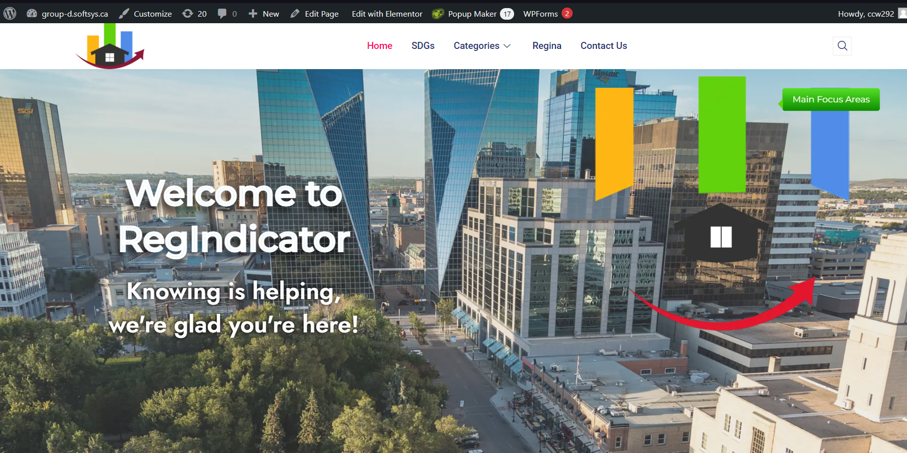
Home page
This is the home page displaying background image of Regina. The logo is interactive allowing seamless user experience from home to data page
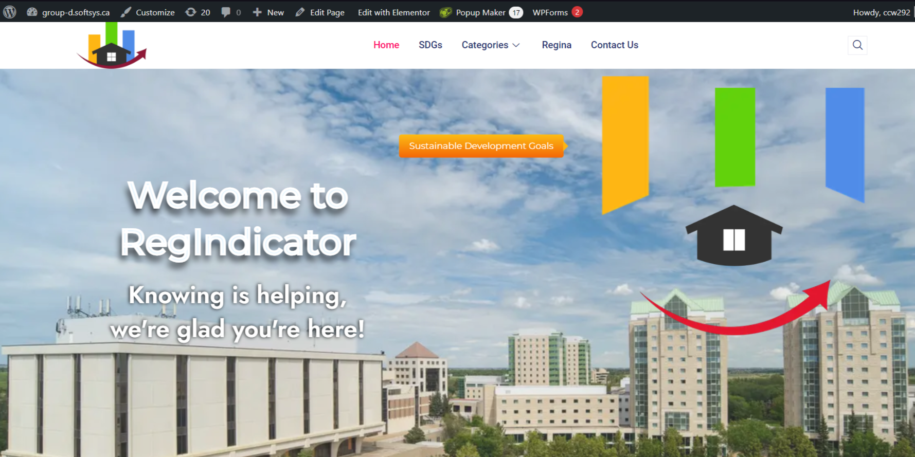
Home Page
Another logo part being interacted as a link to a data page
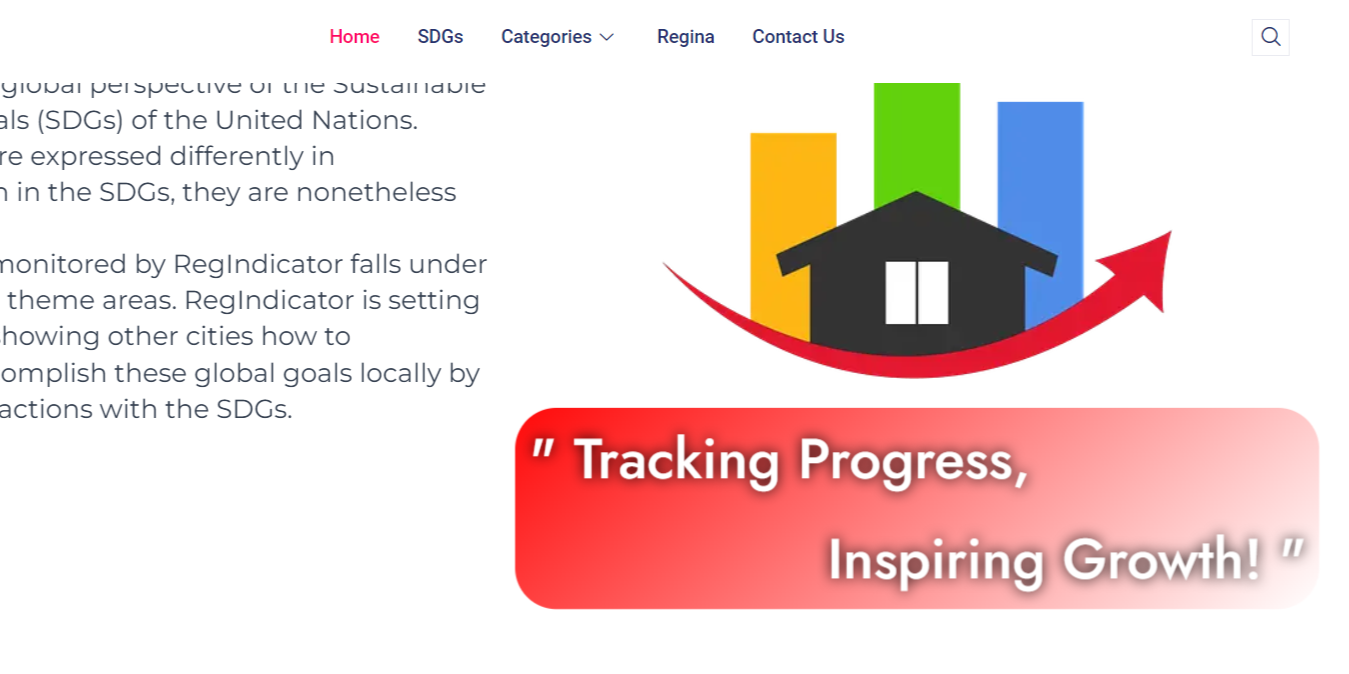
Intro to the Page
Describes what the page is about and its purpose in brief and concise way.
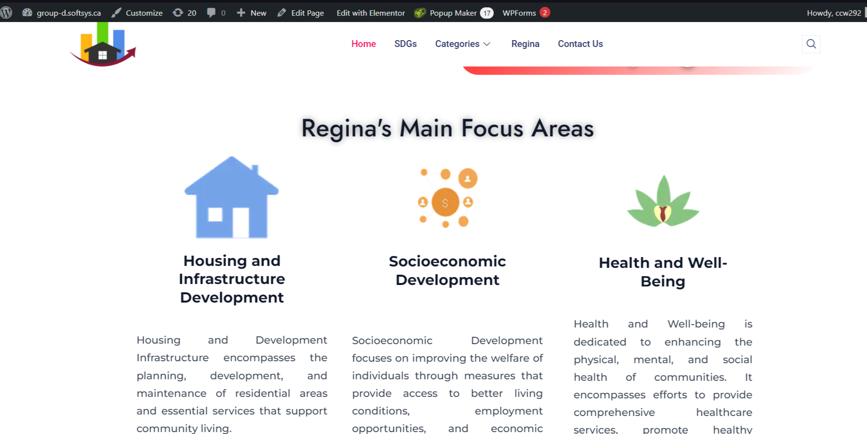
Categories of the SDGs
Displays all the sustainable development goals.
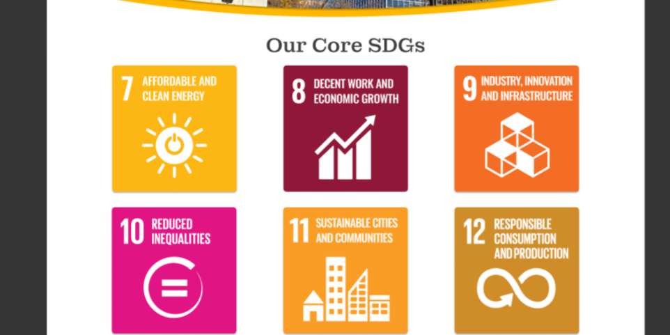
Sustainable Development Goals
A page dedicated to explain the relavant SDGs in Regina and their purpose.
Data Visualization
The site’s interactive charts and graphs are powered by the Graphina – Elementor Charts and Graphs plugin, which reads the JSON endpoints generated nightly by the data-ingestion pipeline. Graphina dynamically renders line, bar, pie, and radial gauges that update automatically as new SDG figures arrive, ensuring the dashboard always reflects the latest community metrics. Each chart is fully interactive—hovering over data points reveals tooltips with exact values, and built-in controls allow users to toggle series on and off for customized comparisons. Because Graphina is tightly integrated into Elementor, the visualizations inherit the site’s color-coded SDG palette and responsive layout, preserving design consistency from Figma through to the live WordPress pages
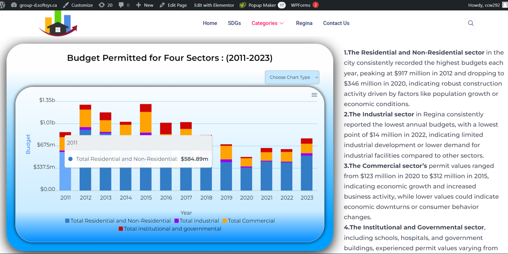
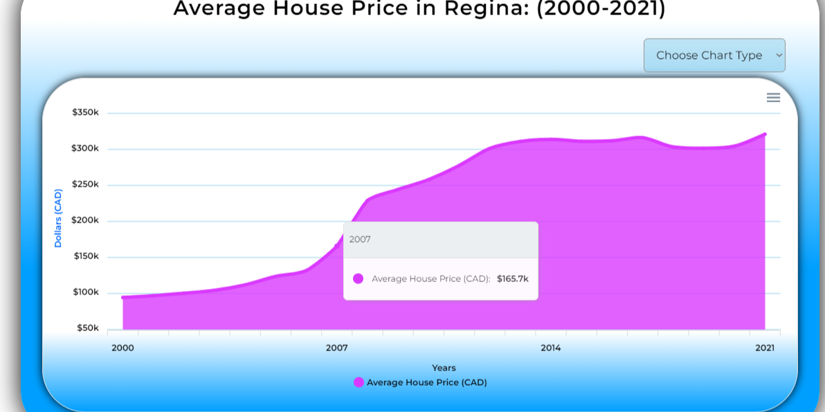
Data page
Each visual data is tailored to suit best for that specific type of data. It paves a way for easier acknowledgement of the context for better user experience.
Data Variation
User can select different types of visual data for better clarity, all project-detail-thanks to the Graphina plugin

Data Variation
User can select different types of visual data for better clarity, all project-detail-thanks to the Graphina plugin
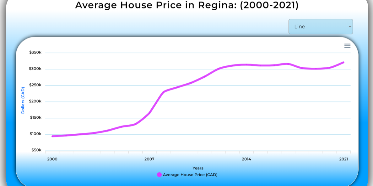
Data Variation
User can select different types of visual data for better clarity, all project-detail-thanks to the Graphina plugin
Key Takeaways
- Figma Prototypes allowed to understand concept better with the real life stakeholders and gain their feedback on the products
- In the Wordpress environment, built on a lightweight starter (Astra) then extended via PHP templates, hook-based functions, and Elementor template overrides.
- Graphina plugin configured to consume the JSON endpoints using data excel files and render interactive line, bar, and pie charts.
- Chart settings (colors, labels, tooltips) driven by PHP-generated shortcode attributes, ensuring consistency with the SDG color palette defined in Figma.